Candlevolume Charts
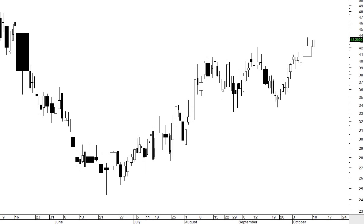
Candlevolume Charts are a combination of both the candlestick charts and equivolume charts. This combination provides what is missing in the equivolume charts, the open and close as well as the high and the low for that time period. Volume is shown as the width of the candle.

In the chart above, the very wide candle shows the volume surge also seen in the volume bars below it. The candlevolume chart tends to distort the chart and may be more difficult for traders to interpret price action accurately. Candlevolume charts are used mostly by futures traders, commodities traders, and intraday traders.
The assumption of the interpretation of candlevolume charts is that the candlevolume represents supply and demand. However in the automated marketplace with High Frequency traders, and Dark Pool institutional activity not shown intraday, the interpretation of supply and demand is easily distorted and misrepresented.
The goal of combining the volume into the candlesticks was to provide faster analysis for traders. It may benefit some traders who struggle to read volume bars or other volume indicators but an understanding of what volume means in relation to price AND how volume exhaustion patterns an HFTs volume over extended patterns move price is also critical to understand to properly interpret these charts.
The understanding of how Dark Pools alter price and volume patterns is also important to understand and recognize. Candlevolume charts can distort price patterns which may be more difficult for some traders to analyze.


